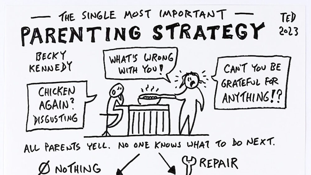
Most one of my short-form explainers start as someone else’s idea and ends as a single hand-drawn page. In this video I walk through exactly how I get from one to the other, using Becky Kennedy’s TED talk on parenting as the raw material. Here’s my process, step by step, in case you’d like to borrow any of it for your own visual thinking projects.
Step 1: Take rough first-draft notes, just for me
While watching the talk, I took notes in my daily-driver notebook, capturing the ideas one chunk at a time with quick little sketches along the way. These first notes aren’t meant for anyone else, they’re just for me, so I let them be messy and lean more verbal than visual.
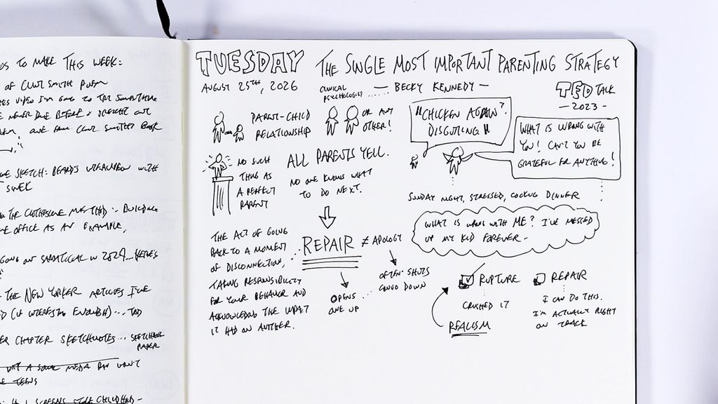
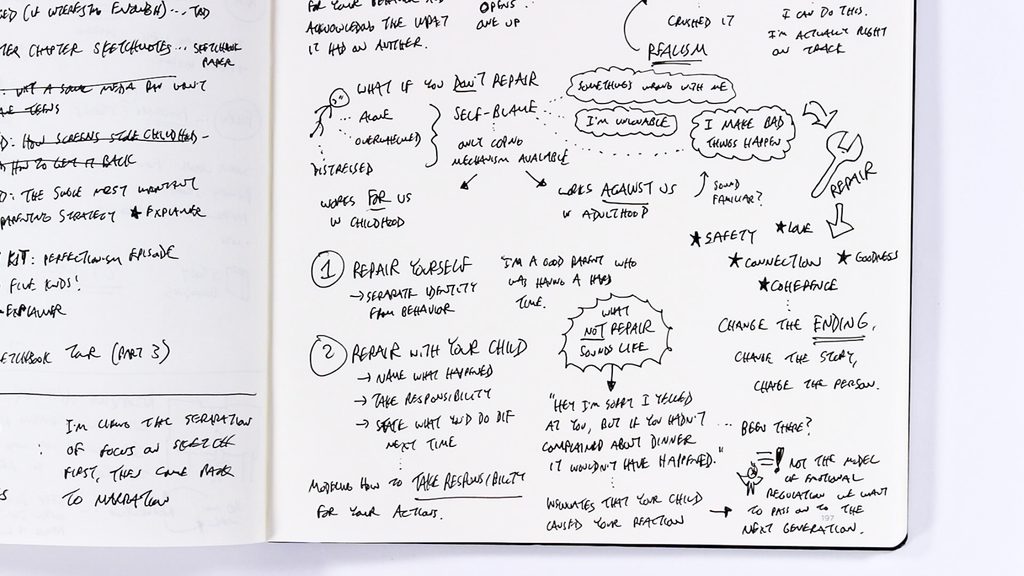
A couple of habits show up in this stage. I often use a ≠ symbol whenever a talk draws a distinction between two similar-but-different ideas (here, repair ≠ apology). And I only quote word-for-word when I’m capturing the definition of an important concept, otherwise I focus on short phrases and often put things in my own words.
Step 2: Sketch a handful of thumbnail layouts
My goal with this project is a one-page summary, which I’ll be sketching out on a 9×12 sheet oriented vertically. Before committing to anything, I draw a few boxes on the page and force myself to try several layouts.
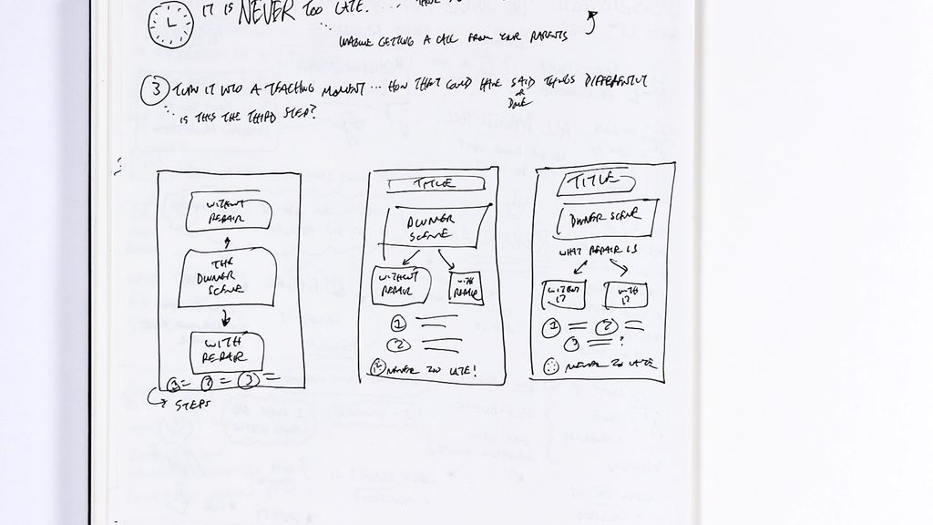
I flip back to my notes to remind myself of the big ideas and what’s worth highlighting, then experiment with the order: Should the dinner scene sit in the center? Should “What is repair?” come before or after showing what happens with and without it? I don’t bother drawing the actual images at this stage. I just use the boxes as placeholders so I can feel out the overall layout and flow. Once the third layout clicked, I ran with it.
Step 3: Build a full digital draft
Next I go digital, working on my iPad in the app Concepts to sketch out a complete draft. This is where I actually place everything: the title, the dinner scene, the kid’s complaint and the parent’s response, the definition of repair, the with-and-without comparison, the steps, and the reminder that it’s never too late.
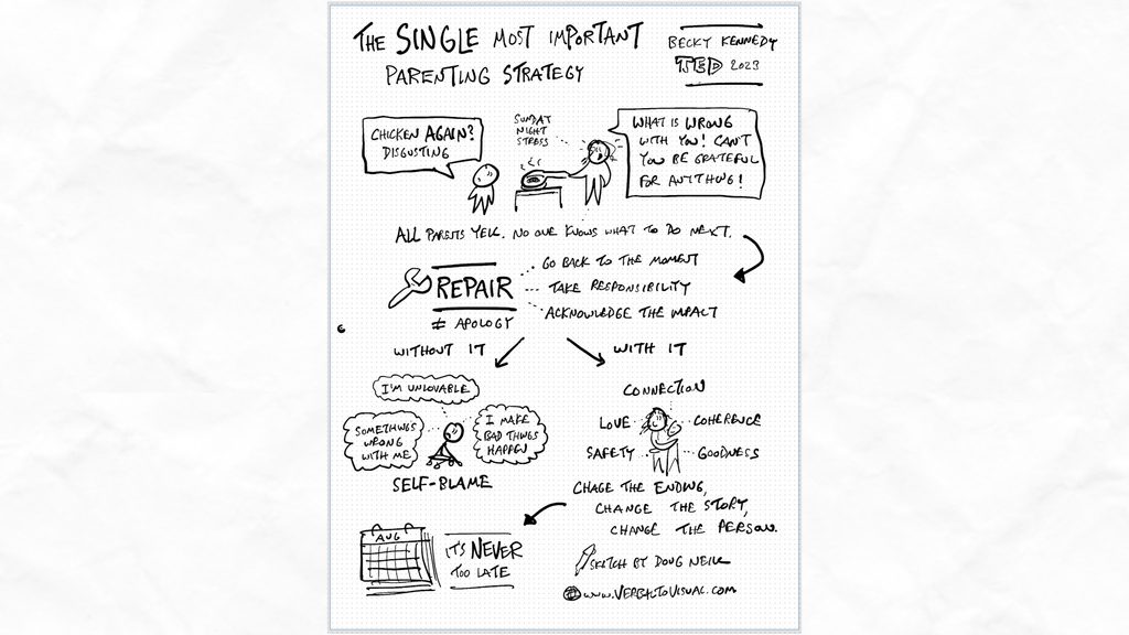
I’m making small decisions the whole way through. The full word-for-word definition felt too text-heavy, so I boiled it down to three bullet points. For “it’s never too late,” I swapped the clock from my early notes for a calendar, since the real message is about longer stretches of time. And I looked for strong visual contrasts, the child alone versus the child being held.
Step 4: Step back, then rework the visuals
Here’s the step I think matters most. When I looked at that complete digital draft, it had all the right ideas but it was far too text-heavy, very one-note, with everything carrying the same weight and nothing pulling your eye in.
So I lassoed everything except the title and moved it off to the side (keeping those elements in case I wanted them later), then focused on a bigger, bolder sketch of the dinner scene and the concept of repair. From there I did a bit of A/B testing between the old and new versions, then blended the two. Along the way I found a better storytelling flow: hold off on even naming “repair” until after you’ve seen what happens if you do nothing, and seen the alternative.
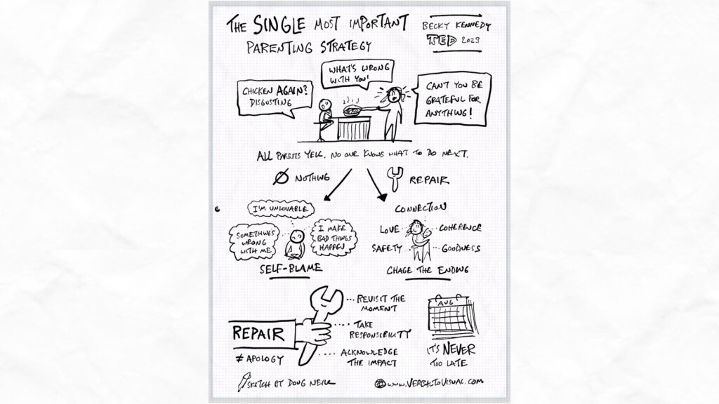
A few smaller refinements happened here too. I like to draw people consistently, so I redrew the figures as star people (and experimented to make sure I could draw one sitting cross-legged), while keeping the lone kid as a deliberate contrast. And I decided to leave the parent’s thought bubbles off the page entirely, mostly for space, figuring I could mention those details in the narration instead. That’s a handy thing to remember: the text alongside a visual (a caption, a blog post, a voiceover) is a great place to hold details that don’t need to crowd the sketch itself.
Step 5: Draw the final version by hand
Once the digital draft felt cleaner and more visually engaging, I exported it as an image and used it as a reference while recording myself sketching the whole thing out with pen and paper.
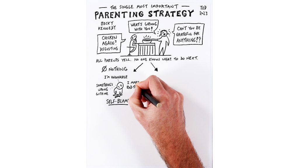
You can see me use my fingers to figure out where the first marks should go. When I got to the title, my earlier experiments told me I didn’t quite have enough room up top, so I improvised, writing “single most important” small and then highlighting “parenting strategy,” since those are the words that matter most. The spacing didn’t come out perfect: there’s more white space in the bottom half than the top. But I’m okay with those kinds of imperfections, and on the whole I’m happy with how it turned out.
If you haven’t watched it yet, go check out the short-form explainer this process led to. And if any of these techniques look interesting, feel free to try them out and adapt them for your own visual thinking projects.
For more support developing your skills, check out our library of courses.