How much effort do you put into the projects that you take on in your personal or professional life?
What impact does that effort have?
I think it’s worth exploring those questions for any activities that you regularly take on in your life, and a graph like this one is one way that you can explore that, to map out the various stages of your effort and think about the impact that those stages have.
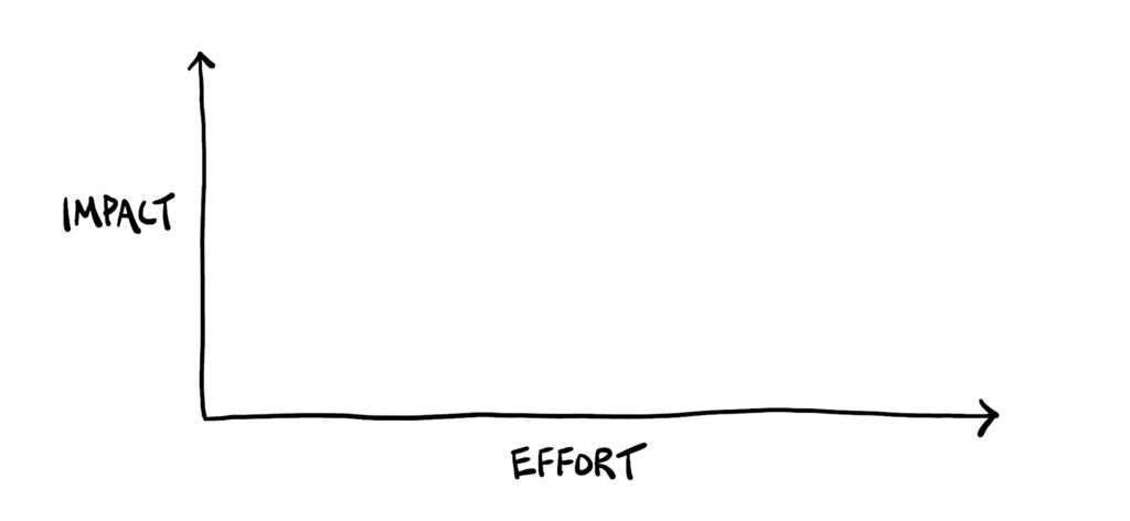
Here I’d like to share the Impact vs Effort Curve for visual note-taking, the skill of sketching out ideas, which is what I teach here.
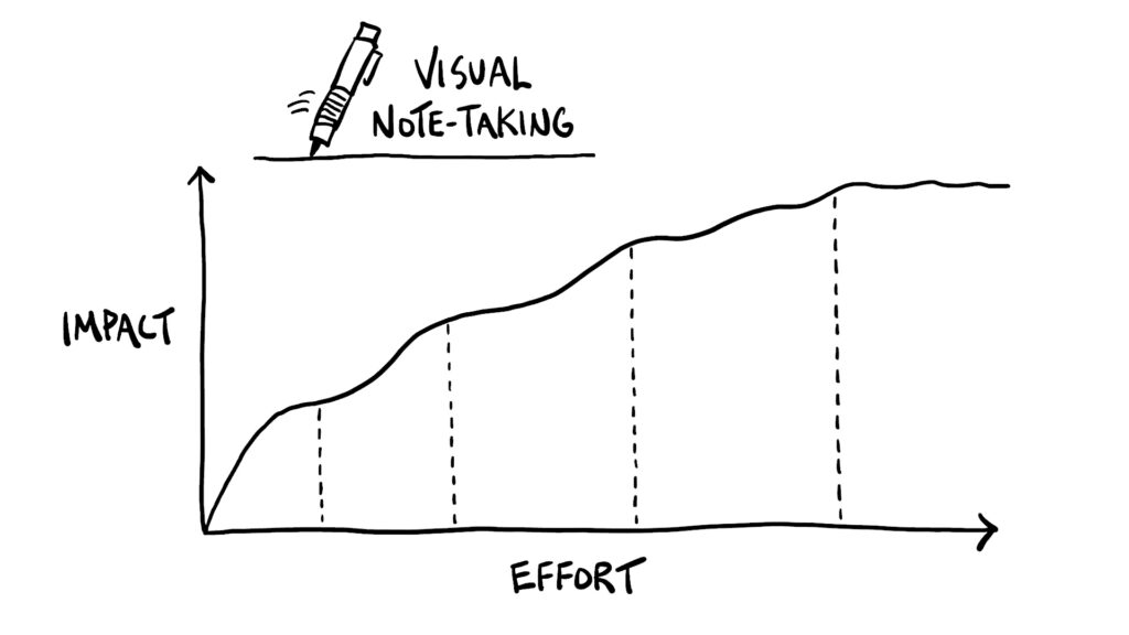
For folks who are interested in adding more of a visual component to the ideas that you’re learning or the problems that you’re working on solving or the concepts that you’re communicating to others, I think it can be helpful to identify the different stages of effort that you might put into the visualization process, making note of the increased impact at each stage and also noting when that impact starts to taper off.
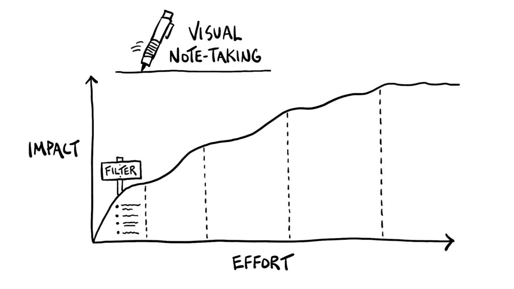
I consider the first stage of visual note-taking to be a filtering process. As you’re taking in new information or thinking through a particular problem, you’re pulling out the most important ideas, maybe in something as simple as a bulleted list.
That’s the first impactful activity that makes use of your judgment skills to focus just on the most important ideas that you then start to give some structure to in the next stage of the visual note-taking process.
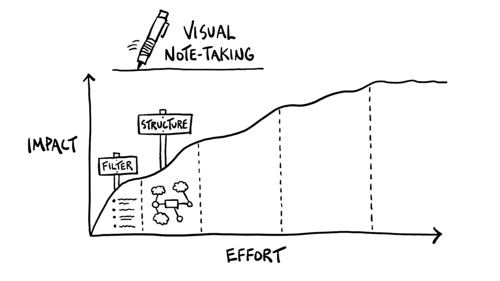
Here you focus on how those ideas are related to each other, perhaps by creating a mind map that captures the set of ideas with containers and connectors.
That effort leads to increased impact because of the way you’re identifying relationships between ideas, which will make them easier to remember or work with.
Next you might focus your effort on sketching those ideas out.
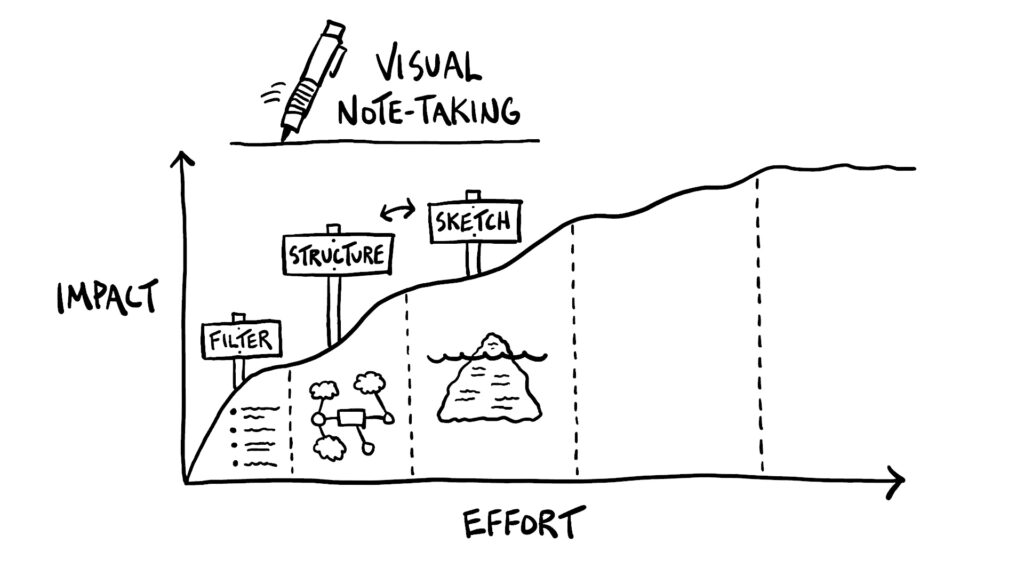
Is there perhaps a visual metaphor that could serve as a useful anchor to those ideas, like the ice iceberg model, for example? Or maybe there’s a simple scene that you could sketch out with stick figures?
This task of capturing more visuals on the page bumps you up that impact curve because it makes it easier for you to see, literally, what it is that you’re working with. You can better picture the scenario and engage more parts of your brain than if you were working with words alone.
Those two steps of exploring structure and exploring through sketches could really go in either order. You could do some sketching first and then think about structure, or even try to do both at the same time.
But that joining of a sketch and structure might come in a separate stage that focuses on refinement.
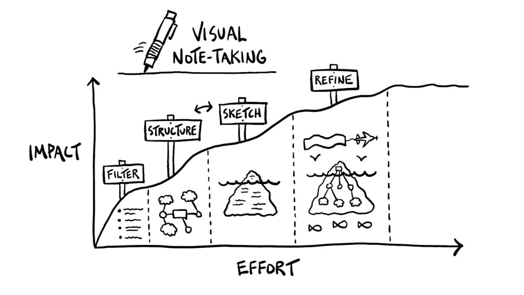
You look for opportunities to bring in the helpful visuals that you explored in the sketching stage with the relationships that you identified in the structure stage and perhaps add some other useful visual cues.
Maybe you flesh out the particular visual metaphor a bit more to create for yourself a picture, a visual artifact, that conveys the most important elements of the new thing that you’re learning or the problem that you’re working through in a sticky way, that’s easier for you to remember in the future and that also makes for a better jumping off point to expand on those ideas or explore new lines of questioning.
With those four stages of effort we’ve steadily been working up the impact curve and have created a useful resource. But it’s easy for us to feel like it’s not good enough yet, and that you still need to do more tweaking to make it better.
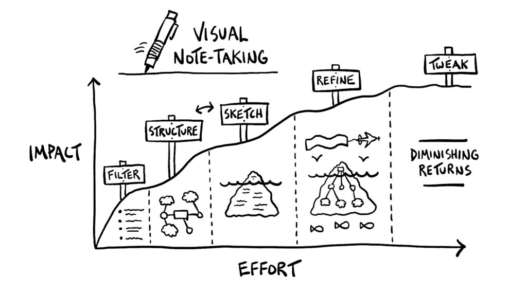
This is the stage where that impact curve starts to level off, where the increased effort that you put into this particular visual note-taking session isn’t actually making the visual nodes any more impactful, so that’s when you enter the section of diminishing returns.
What you want to look out for, then, is when you start to transition from that stage of helpful refinement to unnecessary tweaking. That’s a good place for you to stop sketchnoting, to say to yourself “Yep, I’ve created this helpful visual artifact, let’s make use of it as is and move on to the next thing.”
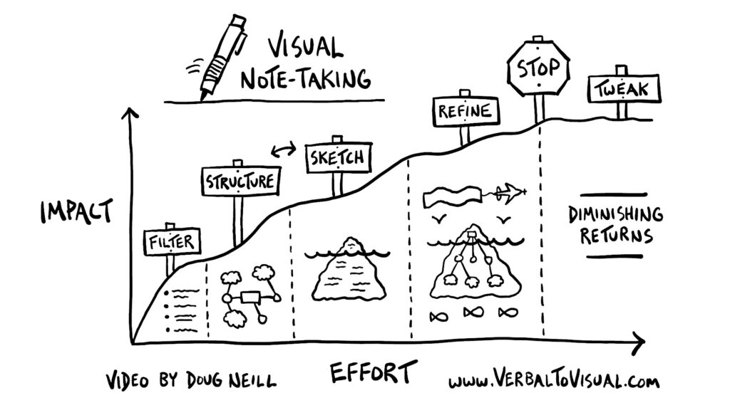
Because of the visual nature of sketchnoting, it is easy to fall into the trap of endless tweaking, which is why I encourage you to ask yourself: are the adjustments you’re making creating something that’s going to be more impactful than what you already have? If not, let yourself wrap up that project and enjoy the feeling of being done with something.
Of course the details of these stages and the sharpness of the curves will vary from person to person, so if you feel like this one doesn’t fit your process then sketch out your own graph and use it as a reference the next time you hop into a sketchnoting session.
If you would like some more support developing your visual note-taking skills, come join us inside of Verbal to Visual.
That’s where you’ll find a whole library of courses to get you up and running, and ongoing live events to get some feedback and connect with other visual thinkers from around the world.
I’ll be back again soon the next time I complete this process, work my way up that impact curve for the sketches that I make for videos like the one I share above.
So this is a good time to stop for now, but I’ll see you again soon.
-Doug
